UI / UX DESIGN · MOBILE APP
Design Process → 01 The Problem → 02 User Stories → 03 Lo-Fi → 04 Mid-Fi → 05 Test → ↺ Iterate
BusIQ — a campus bus app born from cold mornings and missed rides.
A real-time transit tracking app designed for Ball State students and staff. From a frustrated commuter's notebook to a clickable mid-fidelity prototype tested with five riders.
Role
Sole designer — research, IA, wireframes, mid-fi prototype, usability testing
Methods
User stories · Low-fi sketching · Mid-fi prototyping · Think-aloud testing · Post-task interviews
Built with
Balsamiq · Figma · Adobe Photoshop
Course
EMDD 650 · Ball State University · 2026
▸ Why this app
It started at a bus stop, in the cold.
I built BusIQ because of the frustrations I face with the BSU bus — especially in winter, when I have to stand at the stop in the cold with no idea when the bus will actually arrive.
Sometimes I run toward the bus and it pulls off before I get there. Sometimes I leave the warmth of a building too early, and stand outside for fifteen minutes anyway. The information I need exists somewhere — it just doesn't reach me at the moment I need it.
BusIQ is the app I wished I had. A real-time tracker that tells me when to leave, where the bus is, whether the stop is sheltered, and lets the driver know I'm coming.
▸ 02 — User stories
Designing for more than just me.
Before sketching a single screen, I wrote ten user stories that pulled the app away from my own commute and toward a wider community — international students, custodians with low tech-literacy, seniors waiting in cars, riders with asthma, and night commuters.
Leave Now smart notification
"As a student with asthma, in cold weather, I want to know when to step outside so that I minimize exposure to harsh conditions."
Audio input & feedback
"As a custodian with little literacy in technology, I just want an app to say 'the bus is 2 minutes away' so I don't miss it."
Live GPS tracking
"As a senior commuter who waits in my car during winter, I want to see the bus location in real time so I don't miss it."
Language filter
"As an international student whose first language is not English, I want to change the language so I don't get lost reading routes and stops."
Minute-by-minute ETA countdown
"As a student, I want an accurate countdown timer so I know exactly when to leave."
Plain-language route descriptions
"As a new or international student, I want simple route explanations so I don't feel confused navigating campus."
Sheltered & safer night-stop tags
"As a night rider, I want safer stop recommendations so I feel secure."
Push notifications for delays
"As a student going to class or work, I want delay notifications so I can adjust plans early."
Stop info cards
"As a rider unfamiliar with stops, I want contextual information about each stop so I know where it leads."
Simplified Next-Step mode
"As a frequent user, I want clarity instead of a dense map so navigation feels simple."
▸ 03 — Low-fidelity wireframes
Sketching the spine of the journey.
With user stories pinned to the wall, I sketched five low-fidelity screens in Balsamiq — language and accessibility on the home screen, bus selection, sheltered/well-lit stop filters, an ETA confirmation, and a live tracking map. The goal at this stage wasn't beauty; it was making sure the path from "I want to catch the bus" to "I'm on it" had no missing steps.
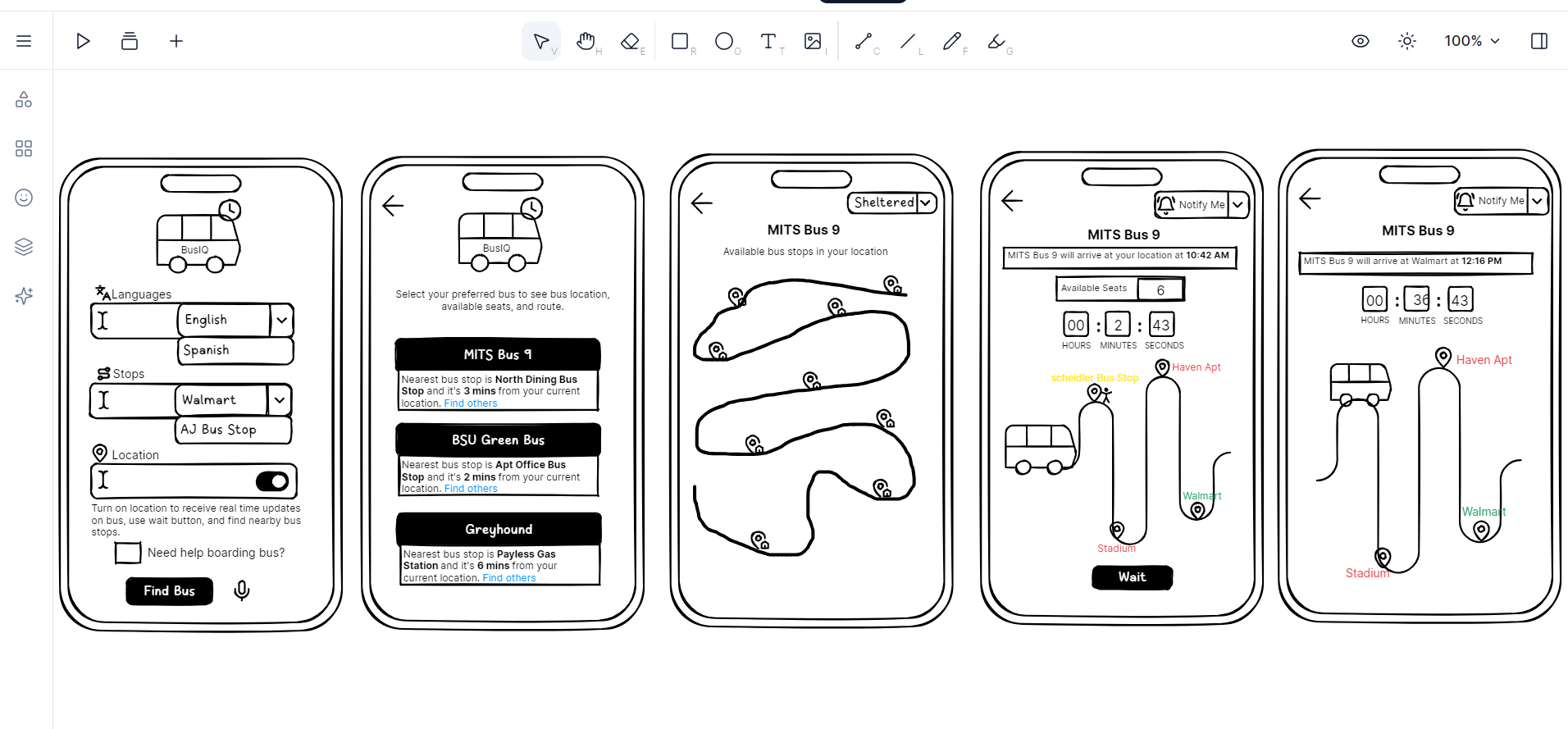
Five hand-sketched flows — language selection, bus list, stop map, ETA countdown, and live tracking.
▸ 04 — Mid-fidelity prototype
Bringing the flow into color, scale, and tap-targets.
In Figma I rebuilt the wireframes as six mid-fidelity screens, anchored by a calm blue palette and a soft, accessible type scale. Two ideas drove the visual decisions: accessibility belongs on the home screen, not buried in settings, and a rider deciding whether to leave a warm building needs three pieces of information at a glance — bus, stop, and time.
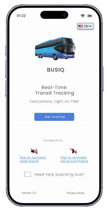
01 — Welcome
Accessibility lives on the home screen, not buried in settings.
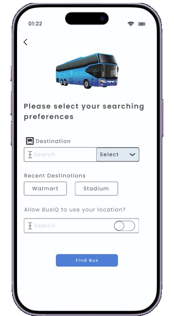
02 — Searching preferences
Recent destinations and location toggle for one-tap planning.
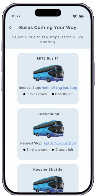
03 — Buses coming your way
Three glanceable facts per bus: stop, time, seats.
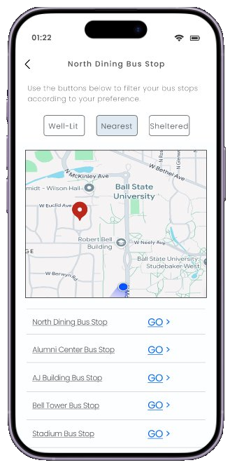
04 — Stop filters
Filter chips for Well-Lit, Nearest, and Sheltered stops.
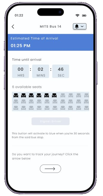
05 — ETA & Signal Driver
Countdown, live seat map, and a button that activates as the bus approaches.
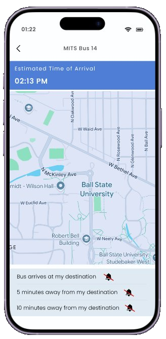
06 — Live tracking & alerts
Layered alerts at 10, 5, and arrival.
▸ 05 — Usability testing
Five riders. Two tasks. Think-aloud.
I ran the mid-fi prototype past five participants — daily riders, occasional users, an international grad student, a transfer student — using a combination of post-task questions and think-aloud sessions. Think-aloud reveals not just whether someone succeeds at a task, but why they hesitate.
Task 1
"You just missed your bus and need to catch the next one as fast as possible — walk me through what you would do."
Task 2
"You're at your stop and the bus is about to leave — show me how you would let the driver know you're there."
What I learned, and what I changed
| Finding | What I observed | Change |
|---|---|---|
| Stop filter chips | Users understood 'Nearest' immediately but were confused by 'Sheltered' vs 'Well-lit'. | Add a tooltip or one-line description under each filter chip. |
| Trip confirmation screen | All five users paused here positively — it felt reassuring before tracking began. | Keep as-is; add an 'Edit trip' shortcut for power users. |
| Boarding help & accessibility | All five praised the home-screen accessibility options. | Keep as is — protect this surface in future iterations. |
| Signal Driver button | Three of five users didn't know what the button was for. | Add a clearer one-line description beneath the button. |
▸ Reflection
Designing for the cold mornings I haven't had yet.
The most useful thing think-aloud testing taught me is that designers over-trust their own filter labels. "Sheltered" and "Well-lit" felt obvious to me — they confused most of my riders. A single sentence underneath would have closed the gap.
The next iteration leans into clarity: tooltips on filters, a confident description under the Signal Driver button, and an "Edit trip" affordance on the confirmation screen — because the participants who paused there were doing so happily, and I want to give them a reason to stay.
Have a transit, civic, or accessibility brief?